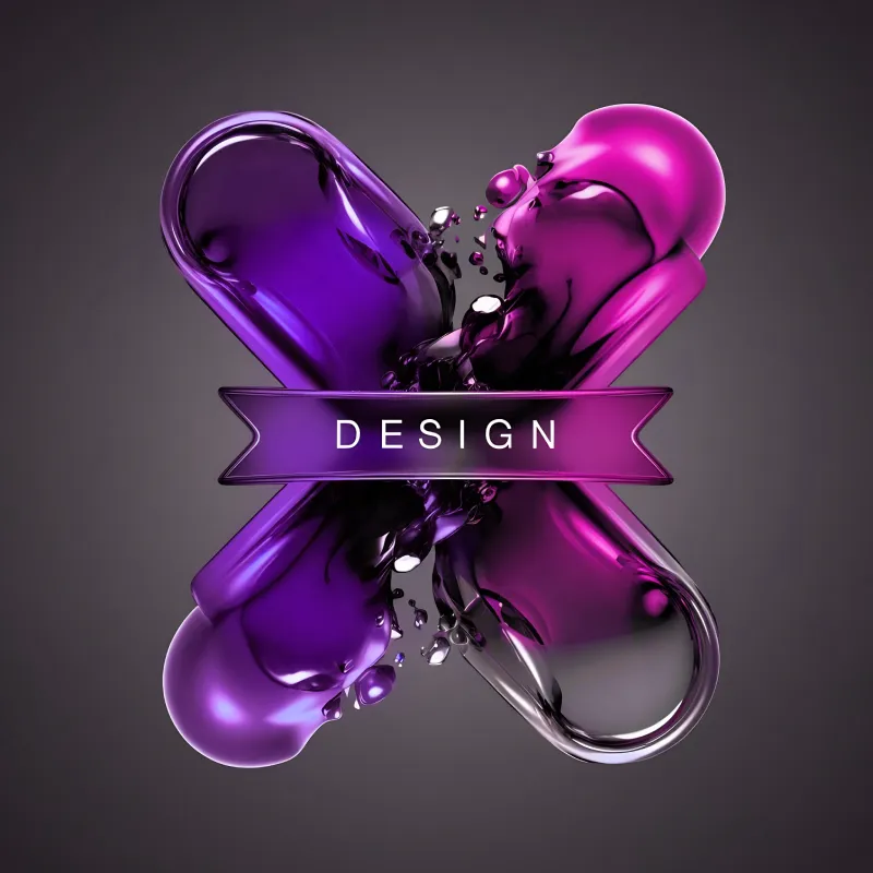
Logo Design & Brand Identity
Stand out in the US, Australia, and New Zealand with a brand people remember.
Your logo shapes how customers judge your business in seconds. A poorly designed logo can make your brand look unprofessional, while a clear and consistent identity builds instant trust.
We create custom logo design and brand identity systems tailored for businesses that want to grow, attract better clients, and look credible across every platform. From startups to established companies, strong branding helps you get noticed and chosen.
Pricing Plan
Includes:
Includes:
Includes:
Introduction
Most logos fail long before they are even designed. The real problem starts when design decisions are made without strategy.
A logo that looks attractive but lacks meaning will not help a brand grow. Many businesses end up with designs that follow trends, look similar to competitors, or fail to connect with their audience. Over time, these logos become forgettable.
A strong logo should communicate purpose, build recognition, and reflect brand identity. Without these elements, it becomes just another graphic with no impact.
Learn why branding matters from Forbes insights on brand perception
Poor branding creates confusion, and confused customers rarely convert.
When your visual identity is inconsistent or unclear, people struggle to understand your business. This affects trust, and trust directly impacts buying decisions. Even high quality services can be overlooked if the brand does not appear reliable.
Branding also influences how memorable your business is. Without a clear identity, customers forget you and move toward competitors who present themselves more confidently.
There is a big difference between something that looks good and something that works.
Good looking branding focuses on visual appeal. It may catch attention for a moment but does not always communicate a clear message. Effective branding, on the other hand, is built with purpose.
Every color, font, and design element plays a role in shaping perception. It tells your audience who you are, what you stand for, and why they should trust you.
In the long run, effective branding creates recognition and loyalty, while purely aesthetic design fades away.
Watch Design principles explained by Interaction Design Foundation
What we Give
A memorable visual identity makes your business easier to recognize across every touchpoint. From your website to social platforms, a consistent look helps people recall your brand without effort. Over time, this familiarity builds preference and keeps you ahead of competitors.
People judge a business within seconds. A refined and consistent brand presence creates a sense of reliability before a single word is read. When everything looks aligned and intentional, your audience feels more confident choosing you.
Strong branding removes hesitation. When your visuals, messaging, and structure feel clear, users find it easier to take action. Whether it’s making a purchase or sending an inquiry, good design supports better decision making at every step.
Your brand should feel the same everywhere. From social media posts to business cards, consistency keeps your business looking professional and organized. It also creates a smoother experience for your audience, no matter where they interact with you.
What Is Included
Building a strong brand takes more than just a logo. Every element needs to work together to create a clear, consistent, and professional identity across all platforms.
AlSam Digital Agency delivers a complete brand identity system designed for businesses targeting competitive markets in Australia, the United States, and New Zealand.
A logo should do more than look good. It should tell your story at a glance and stay memorable in a crowded market.
Each logo is crafted based on research into your industry, competitors, and audience. The goal is to create something distinctive, versatile, and aligned with your brand’s long term vision.
Concepts are designed to work across digital and print, ensuring your brand looks consistent whether it appears on a website, business card, or advertisement.
Colors play a major role in how your audience perceives your business. A consistent color system builds recognition and trust over time.
A complete palette is developed, including primary, secondary, and accent colors. Each color is selected with strategy in mind, considering psychology, accessibility, and cultural relevance across AU, US, and NZ markets.
You receive exact color codes for web and print, so your brand remains consistent everywhere.
Typography defines how your brand communicates visually. The right font combination improves readability while reinforcing your brand personality.
A structured typography system is created, including font pairings for headings, subheadings, and body text. Clear usage rules ensure consistency across websites, social media, and marketing materials.
This approach ensures your brand looks clean and professional on all devices, from mobile screens to large displays.
Without clear guidelines, even the best designs can lose consistency over time.
A detailed brand guideline document is provided to help you maintain a unified look across all channels. It includes logo usage, spacing rules, color application, typography standards, and visual do’s and don’ts.
This makes it easy for your internal team or external designers to keep everything aligned as your business grows.
Your brand needs to look just as strong on social media as it does on your website.
Custom-designed assets are created for platforms such as Instagram, Facebook, and LinkedIn. These include profile images, cover banners, post templates, and story designs.
Each asset is aligned with your brand identity, helping you maintain a consistent and professional presence that builds trust with your audience.
Having the right files ensures you can use your brand assets without limitations.
You receive a complete package of high-quality formats suitable for both digital and print. This includes vector files for scalability and standard formats for everyday use.
All files are neatly organized, so you can easily access and use them across websites, marketing campaigns, packaging, and more.
Clean, simple, and highly memorable.
Minimal logos focus on removing clutter and highlighting what truly matters. This style uses clear typography, balanced spacing, and limited colors to create a timeless identity. It works exceptionally well for businesses that want a modern and professional presence without overwhelming visuals.
Minimal logos are easy to scale, which makes them ideal for websites, social media, packaging, and mobile applications. Many growing brands prefer this style because it keeps their identity consistent across all platforms.
Fresh, bold, and designed for today’s market.
Modern business logos reflect current design trends while keeping your brand approachable and professional. They often include creative typography, subtle gradients, and unique layouts that help your business stand out in competitive industries.
This style is perfect for startups, tech companies, and service-based businesses targeting digital audiences. A modern logo communicates innovation and helps position your brand as forward-thinking.
Professional, structured, and built for trust.
Corporate logos are designed to communicate stability, authority, and reliability. They use strong typography, clean layouts, and balanced proportions to create a serious and credible brand image.
This style is widely used by financial firms, legal companies, and B2B organizations where trust is a key decision factor. A well-designed corporate logo ensures your brand looks consistent across presentations, documents, and digital platforms.
Optimized for online visibility and conversions.
Ecommerce logos are created with digital performance in mind. They are designed to look sharp on websites, marketplaces, and social media platforms while staying recognizable at any size.
These logos often include distinctive icons and clean fonts that make your brand easy to identify instantly. A strong ecommerce logo helps build trust with online shoppers and improves brand recall during the buying journey.
Unique, flexible, and tailored to your business.
Custom brand styles go beyond standard logo design. Every element is created from scratch to reflect your brand’s personality, voice, and long-term vision. This includes typography, color systems, visual tone, and supporting graphics.
This approach is ideal for businesses that want to stand out in saturated markets and build a deeper connection with their audience. A custom style ensures consistency across all touchpoints while giving your brand room to grow.
This stage focuses on understanding the foundation of the business. It includes brand values, goals, tone of voice, and audience behavior. The aim is to identify what the brand stands for and how it should be perceived in competitive markets such as Australia, the United States, and New Zealand. This step ensures the design direction is meaningful rather than purely visual.
Once the brand foundation is clear, in depth research begins. This includes competitor analysis, industry trends, color psychology, typography styles, and visual positioning. The outcome of this stage is a clear creative direction that guides all design decisions. It ensures the identity is not only modern but also relevant to the target market.
At this stage, ideas start transforming into visual concepts. Multiple logo directions and identity styles are developed to explore different creative possibilities. Each concept is designed with purpose, focusing on simplicity, memorability, and brand alignment. This helps in presenting options that feel distinct yet strategically aligned with the business goals.
Feedback is an essential part of shaping the final identity. Selected concepts are refined based on input, ensuring the design feels balanced and aligned with expectations. Adjustments may include typography improvements, spacing corrections, color refinement, and overall visual harmony. The goal is to achieve a polished and professional identity that works across all platforms.
The final stage focuses on preparing everything needed for real world use. This includes logo variations, color codes, typography guidelines, and brand usage instructions. Files are organized for both digital and print applications, ensuring consistency across websites, social media, packaging, and advertising materials.
A logo is the most recognizable visual element of a business. It is a simple mark that represents a company across all platforms and helps people identify it instantly.
A logo can be made using text, symbols, or a combination of both. The purpose is recognition, not decoration. A well designed logo communicates professionalism, trust, and clarity within seconds.
A logo is used across websites, social media profiles, packaging, business cards, advertisements, and digital campaigns. It acts as the consistent signature of a brand.
Brand identity is the complete visual system that defines how a business looks, feels, and communicates.
It includes more than just a logo. It covers:
When combined, these elements create a unified experience across every customer touchpoint.
A strong brand identity builds trust, improves recognition, and positions a business professionally in competitive markets like Australia, United States, and New Zealand.
A well-structured section is not only about what you say but also how easily a visitor can scan, understand, and act on it. This layout is designed to guide attention naturally, improve readability, and support both SEO and user intent.
When a user lands on your page, their brain reacts before logic kicks in. This instant judgment is explained by the concept of Thin Slicing. Within seconds, visitors decide whether your brand feels reliable or not.
A strong logo and visual identity create clarity at first glance. Clean spacing, intentional color use, and readable typography reduce mental effort. When the layout feels organized, users feel in control. That sense of control keeps them engaged.
Why it matters in layout
Explore how this works in practice through our Logo Design Process and see how structure shapes perception.
For deeper reading on first impression psychology, you can explore the research shared by Nielsen Norman Group
Trust grows when everything feels aligned. Users notice when visuals, tone, and messaging follow a consistent pattern. This consistency triggers the Halo Effect, where one positive impression influences overall perception.
A scattered design creates doubt. A unified identity builds confidence without needing explanation.
Layout driven trust signals
To understand how consistency is built, visit our Brand Identity Services.
For additional credibility insights, refer to Stanford Persuasive Technology Lab.
Conversion improves when users do not have to think too much. A clear layout removes friction and makes decisions easier.
Branding supports conversion by guiding the eye. Every section should lead naturally to the next step. Instead of forcing action, the design should make action feel obvious.
Conversion focused layout elements
Learn how we design for results in our Website Design Services.
You can also explore conversion principles from HubSpot.
Marketing performs better when people remember your brand. Recognition reduces the cost of attention and increases return visits.
A structured brand identity ensures that every campaign feels connected. Whether a user finds you through search or social media, the experience remains consistent.
Layout impact on marketing performance
See how branding integrates with strategy in our Digital Marketing Services.
For broader industry insights, check resources from Search Engine Journal
A logo is often the first thing people notice, but what really matters is how it makes them feel and what they remember afterwards. Many brands don’t struggle because they lack ideas. They struggle because of small mistakes that slowly weaken their identity. Here are ten common issues explained in a simple, real-world way so you can actually see where things go wrong.
Scroll through your industry and you will notice the same shapes and symbols repeating again and again. This happens when businesses play it safe instead of thinking deeply about their identity. The result is a logo that looks fine but feels empty. If people cannot tell you apart in a quick glance, the design is not doing its job.
Your website looks modern, your social media looks casual, and your printed material feels outdated. This kind of mismatch creates confusion. People may not consciously notice it, but they feel it. Strong brands feel the same everywhere because they follow a clear visual and verbal direction.
Without guidelines, every new design becomes a guess. One designer uses a slightly different color, another picks a different font, and over time your brand starts drifting. Guidelines are not restrictions. They are what keep your brand recognizable as it grows.
A detailed logo might look impressive on a large screen but turn messy when reduced in size. Think about where your logo appears today. Mobile screens, social profiles, packaging, ads. If it loses clarity in smaller formats, it loses impact where it matters most.
Colors shape perception faster than words. When colors do not match your brand message, people feel a disconnect. A serious business might appear playful, or a creative brand might feel dull. Choosing colors with intention helps your audience understand you instantly.
Many brands design what they personally like instead of what their audience connects with. This creates a gap. A logo should speak to the people you want to attract, not just reflect internal preferences.
Trying to include too many ideas in one logo often leads to clutter. Extra elements, too many colors, or complex shapes make it harder to understand. Simple designs are easier to recognize and remember.
Fonts carry personality. The wrong typeface can completely change how your brand feels. If typography is chosen without thought, the message becomes unclear even if the logo symbol is strong.
These mistakes are common because they seem small in the moment. But together, they affect how people see, trust, and remember your business.
A strong brand identity is not about making something look good. It is about making something feel right and stay consistent over time.
When your logo and branding are built with clarity and purpose, everything else becomes easier. Marketing feels smoother, trust builds faster, and your business stands out without trying too hard.
Use Cases
A strategic logo solves these issues by creating a strong first impression. It communicates your values, tone, and purpose without needing long explanations. Whether you are pitching to investors or launching your website, your logo becomes the anchor of your brand.
Businesses in the US, AU, and NZ often struggle with building a brand that feels both modern and trustworthy. The same challenge exists globally. A well thought out logo gives startups a competitive edge and builds early trust with their audience.
As businesses evolve, their branding often becomes outdated. This creates a disconnect between what the company offers and how it is perceived.
Rebranding becomes necessary when
Rebranding is not just about changing a logo. It is about redefining your identity to match your current goals. A successful rebrand improves customer perception, strengthens positioning, and creates a unified brand experience across all channels.
Small businesses often underestimate the power of branding. Many rely on basic or inconsistent visuals, which can make them appear less reliable compared to competitors.
Strong branding helps small businesses
Whether you are launching a startup, scaling your company, or running a small business, your brand identity directly affects your growth. Poor branding creates confusion, while strong branding builds clarity and trust.
AlSam Digital Agency focuses on creating branding solutions that are not only visually appealing but also strategically aligned with your business goals. Every logo and brand identity is designed to communicate clearly, connect emotionally, and perform effectively in real world markets.
When someone searches for professional logo file formats, a complete brand kit, or clear branding guidelines, they are usually looking for more than just design. They want clarity, usability, and long term consistency. This section is structured to give both search engines and real users exactly that, with clear hierarchy and scannable content.
AlSam Digital Agency delivers a complete branding package that is ready for immediate use across digital and print platforms. Every file, asset, and document is prepared with real business applications in mind.
Your logo is provided in multiple formats, so you never face limitations when using it.
For Print Use
These formats ensure your logo remains sharp at any size, from small packaging to large outdoor signage.
For Digital Use
You will also receive:
This flexibility ensures your logo performs well on websites, social media, mobile apps, and marketing materials.
Learn how different formats impact quality and usage in this guide from Adobe.
A brand kit brings structure to your visual identity. It ensures everything looks connected and professional.
Your brand kit includes:
Color System
Typography
Visual Elements
Ready to Use Assets
This allows you to maintain a consistent brand presence without repeatedly redesigning assets.
Your branding guidelines act as a rulebook for your identity. This ensures consistency across every platform and team member.
Inside the guidelines document:
Logo Usage Rules
Color Application
Typography Rules
Real World Examples
These guidelines become especially important when working with developers, marketers, or external designers.
To help you get the most out of your branding, explore these related pages:
Link these internally within your website to improve SEO structure and user navigation.
A logo alone is not enough to build recognition. What truly creates a strong brand is consistency across every touchpoint.
With properly structured logo formats, a complete brand kit, and clear branding guidelines, your business is equipped to grow with a professional and unified identity.
This approach not only improves visual appeal but also builds trust, which directly impacts customer perception and conversion.
Why Choose Us
When businesses look for a professional branding agency, they are not just searching for design. They are looking for clarity, consistency, and a brand identity that actually works in the real world. This is where AlSam Digital Agency creates a meaningful difference.
A strong brand is never built on visuals alone. Every project begins with a deep understanding of your business model, your audience behavior, and your market positioning. This ensures that your logo and identity are not only attractive but also purposeful.
If you want to explore how this connects with your broader branding goals, you can also review our Brand Strategy Services page.
Many agencies rely on quick concepts and reusable ideas. That approach often leads to brands that look similar and fail to stand out.
AlSam Digital Agency works differently. As a custom logo design agency, every concept is created from scratch. The focus stays on originality, relevance, and long term usability. Your logo becomes a distinctive asset, not just a graphic.
You can see how this process comes to life by visiting our Portfolio section.
A logo is not only meant for a website. It needs to perform across social media, packaging, business cards, and digital platforms. Every design decision is made with scalability and consistency in mind so your brand looks strong everywhere.
For deeper insights into why this matters, you can read this guide by Forbes on brand consistency and its impact on business growth.
Clients are not kept in the dark. You are involved in key stages from idea development to refinement. This keeps the process aligned with your expectations and ensures that the final outcome truly represents your vision.
If you are planning your next project, feel free to connect through our Contact Us page to discuss your requirements.
Trusted by businesses across the US, Australia, and New Zealand, AlSam Digital Agency brings an understanding of diverse markets and audience preferences. This global exposure allows the team to create brand identities that are both locally relevant and internationally competitive.
The goal is not just to deliver a logo but to build a complete identity system that grows with your business. From typography to color systems and brand guidelines, everything is designed to support consistency over time.
Choosing AlSam Digital Agency means working with a team that combines strategy, creativity, and real business understanding. If you are ready to build a brand that stands out with clarity and confidence, explore our Logo Design and Brand Identity Services to get started.
FAQ's
The cost of logo design in the USA depends on the complexity of the project, the experience of the design team, and whether you need only a logo or a complete brand identity. Basic logo projects are generally more affordable, while businesses looking for strategy, visual identity, brand guidelines, and supporting brand assets can expect a higher investment.
Al Sam provides custom logo design services based on your business goals rather than offering one price for every client. This ensures you receive a solution that matches your brand, industry, and budget.
Branding services in Australia can vary significantly depending on the scope of work. A simple visual identity costs much less than a complete branding package that includes logo design, typography, colour selection, brand guidelines, stationery, and digital assets.
Every business has different requirements, so Al Sam creates personalised branding packages that focus on delivering long-term value instead of unnecessary extras
Yes. Al Sam works with businesses throughout New Zealand, helping companies create professional logos and complete brand identities. Whether you are launching a new business or refreshing an established brand, our team can manage the entire project remotely with clear communication and regular updates.
Absolutely. Many businesses prefer working with remote creative teams because the process is simple and efficient. We collaborate with clients across the United States through online meetings, email, and project management tools, making it easy to complete every stage of the project regardless of location.
Yes. Startups often need a strong visual identity to build trust and stand out in competitive markets. Al Sam helps Australian startups develop memorable logos, consistent brand identities, colour systems, typography, brand guidelines, and marketing assets that support future business growth.
Yes. Our services are fully remote, allowing us to work with clients across the United States, Australia, New Zealand, and many other countries. From the initial consultation to the final delivery, every stage is completed online with smooth communication and timely project updates.
Every project begins with carefully researched and original design concepts based on your business, industry, and target audience. The number of concepts depends on the package you choose, giving you multiple creative directions before selecting the strongest option for refinement.
Revisions are included so your chosen concept can be refined until it aligns with your brand vision. The number of revisions depends on your selected package, and all details are discussed before the project begins. Each revision focuses on improving the design rather than making unnecessary changes.
Yes. We continue to support our clients after delivery whenever assistance is needed. Whether you need help using your logo files, require additional brand assets, or want new marketing materials designed in the future, our team is available to help your brand grow consistently.
Once your project is approved, you will receive professional files suitable for every platform and application.
These typically include:
These formats ensure your logo works perfectly for websites, social media, business cards, packaging, signage, advertising, and high-quality printing.
Yes. Once the project is completed and the final payment has been made, you will receive the editable source files. These files allow future updates, professional printing, resizing, and other design modifications whenever needed.
The timeline depends on the size of the project and the speed of client feedback. Most logo design projects are completed within one to two weeks, while complete brand identity projects may require additional time because they include more design elements and documentation.
A detailed timeline is shared before work begins so you know exactly what to expect.
A complete brand identity package usually includes much more than a logo. Depending on your requirements, it may include:
Everything is designed to create a consistent and professional brand across every customer touchpoint.
Yes. If your current logo feels outdated or no longer reflects your business, we can redesign it while preserving the elements that customers already recognise. The goal is to modernise your brand without losing its identity.
Every logo is designed from scratch. We do not use pre-made templates, copied artwork, or generic graphics. Each design is created specifically for your business to ensure originality, uniqueness, and long-term brand value.
Our process is straightforward and transparent.
First, we learn about your business, industry, audience, and goals.
Next, we research your market and develop original design concepts.
After you select your preferred direction, we refine the design based on your feedback.
Once approved, we prepare all final files and brand assets before delivering everything in organised folders for immediate use.
After the project is completed and the final payment has been received, ownership of the approved logo design is transferred to you. This gives you full rights to use your logo across your website, marketing materials, packaging, advertising, and other business applications.
Yes. Every brand identity is created to perform consistently across digital and printed materials. Whether your logo appears on a website, social media profile, mobile app, brochure, product packaging, billboard, or business card, it will maintain a professional and consistent appearance.
A strong logo is the first step toward a memorable business. If you’re looking to hire a logo designer or need complete branding services, our team is ready to create a brand identity that reflects your vision and supports your growth.
Supporting businesses across the United States, Australia, and New Zealand with professional logo design and brand identity solutions.